
And I’m off to Johannesburg!
Month: May 2008
-
Fly by
-
another t-shirt entry! Vote now!! (3 days left)

“umshini wami” is a Zulu song favored by ex-deputy president Jacob Zuma during his rape trial. it translates: “bring me my machine gun”.
Peace!
Blogged with the Flock Browser -
birthday weekend
On Thursday 22 May, my buddy Quentin turned 35.
On Saturday 24 May, I turned 30.
On Sunday 25 May, it was Jaco’s turn to be 31.This is how we did it:
 Luzanne, Quentin, Richard, Liezel and Chris – we dined in Prince Albert, en route to Matjiesfontein.
 dinner at the Lord Milner – everybody’s here!

 the owner of Matjiesfontein graced us with his presence.
 hot dogs on the lawn.

 some played poker…
 some played boules…
 everybody relaxed :0)


 caught in the courtyard
 save yourself a trip and stock up!
 me and luz – friends since 1993…
 making the big speech.
 how to feed 30 people.
 everyone tried on my hat.


 …even my dad!
 setting up the decks in the Lairds Arms.
 and the party started!


the last group photo – stairway of the Lord Milner the very last group photo by the courtyard fountains.
 Richard – the DJ to end all DJs.
 tea in calitzdorp, on the way home.
good times ;0) -
Second day
389642.jpg (JPEG Image, 868×590 pixels)
Here’s hoping we make it onto today’s roll…
Blogged with the Flock Browser -
8 ways to drive a graphic designer mad.
From ghisroy.com – Rants, Comics & other Sillyness.
As everyone knows, graphic designers are the reason there are so many wars in this world. They get inside our heads with their subliminal advertising, force us against our will to spend money on the worst pieces of shit, and eventually, drive us to depression and random acts of violence. And of course, most of them are communists.
So to do my part to save the world from them, i made a list of things you can do when working with a graphic designer, to assure that they have a burn-out and leave this business FOREVER.
1-Microsoft Office
When you have to send a graphic designer a document, make sure it’s made with a program from Microsoft Office. PC version if possible. If you have to send pictures, you’ll have more success in driving them mad if, instead of just sending a jpeg or a raw camera file, you embed the pictures inside a Microsoft Office document like Word or Powerpoint. Don’t forget to lower the resolution to 72 dpi so that they’ll have to contact you again for a higher quality version. When you send them the “higher” version, make sure the size is at least 50% smaller. And if you’re using email to send the pictures, forget the attatchment once in a while.
2-Fonts
If the graphic designer chooses Helvetica for a font, ask for Arial. If he chooses Arial, ask for Comic Sans. If he chooses Comic Sans, he’s already half-insane, so your job’s half done.
3-More is better
Let’s say you want a newsletter designed. Graphic designers will always try to leave white space everywhere. Large margins, the leading and kerning of text, etc. They will tell you that they do this because it’s easier to read, and leads to a more clean, professional look. But do not believe those lies. The reason they do this is to make the document bigger, with more pages, so that it costs you more at the print shop. Why do they do it? Because graphic designers hate you. They also eat babies. Uncooked, raw baby meat.So make sure you ask them to put smaller margins and really, really small text. Many different fonts are also suggested (bonus if you ask for Comic Sans, Arial or Sand). Ask for clipart. Ask for many pictures (if you don’t know how to send them, refer to #1). They will try to argument, and defend their choices but don’t worry, in the end the client is always right and they will bow to your many requests.
 4-Logos
If you have to send a graphic designer a logo for a particular project, let’s say of a sponsor or partner, be sure to have it really really small and in a low-res gif or jpeg format. Again, bonus points if you insert it in a Word document before sending it. Now you might think that would be enough but if you really want to be successful in lowering the mental stability of a graphic designer, do your best to send a version of the logo over a hard to cut-out background. Black or white backgrounds should be avoided, as they are easy to cut-out with the darken or lighten layer style in photoshop. Once the graphic designer is done working on that bitmap logo, tell him you need it to be bigger.If you need a custom made logo, make your own sketches on a napkin. Or better yet, make your 9 year old kid draw it. Your sketch shouldn’t take more than 5 minutes to make. You don’t want to make something that’s detailed and easy to understand, because the less the designer understands what you want, the more you can make him change things afterwards. Never accept the first logo. Never accept the 9th, make him do many changes, colors, fonts & clip art. Ask him to add a picture in the logo. Bevels. Gradients. Comic Sans. And when he’s at his 10th attempt, tell him that you like the 2nd one the most. I know, it’s mean but remember: graphic designers are the cause of breast cancer among middle aged women.
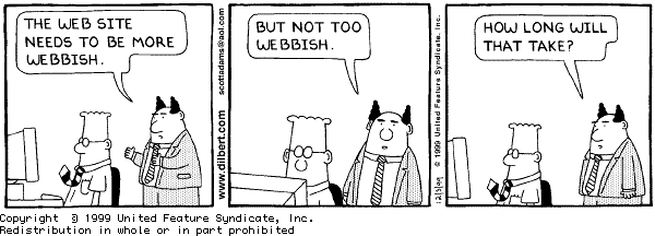
5-Chosing your words
When describing what you want in a design, make sure to use terms that don’t really mean anything. Terms like “jazz it up a bit” or “can you make it more webbish?”. “I would like the design to be beautiful” or “I prefer nice graphics, graphics that, you know, when you look at them you go: Those are nice graphics.” are other options. Don’t feel bad about it, you’ve got the right. In fact, it’s your duty because we all know that on fullmoons, graphic designers shapeshift into werewolves.6-Colors
The best way for you to pick colors (because you don’t want to let the graphic designer choose) is to write random colors on pieces of paper, put them in a hat and choose. The graphic designer will suggest to stay with 2-3 main colors at the most, but no. Choose as many as you like, and make sure to do the hat thing in front of him. While doing it, sing a very annoying song.
7-Deadlines
When it’s your turn to approve the design, take your time. There is no rush. Take two days. Take six. Just as long as when the deadline of the project approaches, you get back to the designer with more corrections and changes that he has time to make. After all, graphic designers are responsible for the 911 attacks.8-Finish him
After you’ve applied this list on your victim, it is part of human nature (although some would argue weather they’re human or not) to get a bit insecure. As he realises that he just can’t satisfy your needs, the graphic designer will most likely abandon all hopes of winning an argument and will just do whatever you tell him to do, without question. You want that in purple? Purple it is. Six different fonts? Sure!You would think that at this point you have won, but don’t forget the goal of this: he has to quit this business. So be ready for the final blow: When making final decisions on colors, shapes, fonts, etc, tell him that you are disappointed by his lack of initiative. Tell him that after all, he is the designer and that he should be the one to put his expertise and talent at work, not you. That you were expecting more output and advices about design from him.
 Tell him you’ve had enough with his lack of creativity and that you would rather do your own layouts on Publisher instead of paying for his services. And there you go. You should have graphic designer all tucked into a straight jacket in no time!Blogged with the Flock Browser
 -
Day in court
 Today’s the day I face the music (D.U.I.) – spare us a thought.
 -
i love banksy

IMG_0455.JPG on Flickr – Photo Sharing!
Big love to Jockohomo for posting the link to photos of the opening of Banksy’s Cans Festival in London.
Blogged with the Flock Browser -
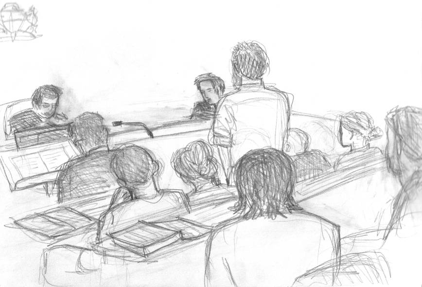
High School Musicals take me back
We went to see a local High School’s production of Rogers & Hammerstein’s “The Sound of Music” on Friday – and I must admit to rather enjoying the whole affair. The singing wasn’t especially horrible and most of the kids had more than 4 facial expressions. (That makes 4 more than Richard Gere.)
 Basically, babe, your Pa should go Nazi.
 The Von Trapp family decides to sing.
 But the Nazi was cute…
 Elsa tried her best to get Max to stand still.
 Whenever she got nervous, Maria imagined them all wearing curtains.
 -
another angry sign
Stefan – a very dear friend of mine – snapped this sign in Burgersdorp:

It reads: “Old Mutual Bank investment of R80 000.00 for 10 years, receive R25 000.00 less than with an ordinary bank”. -
“If my soon to be ‘ex’ husband thinks…”
this photograph was taken in front of Nedbank in George today:

… hehehe – the bastard! you go get him Wendy!
Blogged with the Flock Browser


